Humanitarian data visualization · by Alen Chalak
Humanitarian data, made to speak.
Lessons from inside humanitarian information management: on charts, surveys, dashboards, and the people behind every number.
- Posts
- 26
- Writing since
- Oct 2024
- Reading time
- 100 min
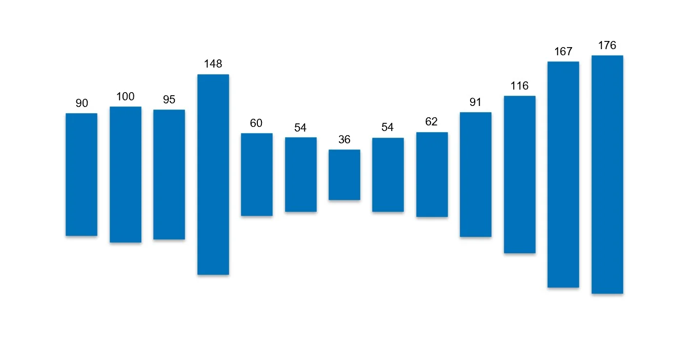
The archive, as a chart
Each block is one post, stacked by month
Latest post
Data can dance. But it can also speak. Loudly…
A playful column-chart animation turns into a reminder of attacks on Ukraine’s energy infrastructure, data that helps guide generator deployment.
Open postEvery post, by date
26 posts
No posts match these filters.
2025
16 posts
May3 posts
No. 26Data can dance. But it can also speak. Loudly…A playful column-chart animation turns into a reminder of attacks on Ukraine’s energy infrastructure, data that helps guide generator deployment.No. 25Start with the BrickShip a simple, useful first version and let feedback build it up, one brick at a time.No. 24Why the Easiest, and Prettiest Map Isn’t Always the Best MapEasy, pretty choropleths let huge regions with small numbers dominate. Bubble maps let the data, not the size of the territory, speak.
April7 posts
No. 23Are We the Minions of the Information World?Information managers should be stewards who ask whether it is the right thing to build, not just executors of tasks.No. 22When a Donut Chart Shifted the NarrativeLearn the rule against donuts, then know when to break it: one donut calmed a lopsided chart and led a team to rethink its categories.No. 21From I to Cube: The Leadership Shape EvolutionCareers grow from deep expertise to whole leadership, from I to T to square to cube, as communication and collaboration become core strengths.No. 20The Global Humanitarian Appeal budget and …The whole 2024 humanitarian appeal, $46.4 billion, looks tiny next to $2.46 trillion in defense spending.No. 19The Power of the Right Question: Lessons from HistoryBreakthroughs come from reframing the question. Humanitarian surveys should challenge the questions they inherit.No. 18The Ceiling-to-Launchpad Effect: Transforming Survey Challenges into OpportunitiesDuplicated surveys, outdated methods and unused data can become a launchpad, through an assessment registry, essential indicators and partner engagement.No. 17Better Surveys, Smarter Data: How Information Management Can Lead the WayInformation management should shape surveys by standardizing, coordinating and questioning them, not just digitize the forms.
February3 posts
No. 16Never Be the Smartest Person in the RoomInformation management is a service. Its value comes from listening and being useful, not from looking clever.No. 15From Ordinary to Extraordinary: The Art of Transformative Data VisualizationThe same data becomes clearer and more credible when a dashboard is designed, not left on default settings.No. 14Why Your Graph is Lying to You (And How to Fix It)A survey estimate shown without its margin of error looks precise and invites overconfident decisions.
January3 posts
No. 13Beyond the Data – Being Played vs. Being a PlayerIn data management you either react to other people’s moves or see the whole board and move with intent.No. 12Creativity Meets Impact: Data Visualization in Humanitarian ResponseThe tool that tracks corporate KPIs can also make humanitarian results clear and transparent for every audience.No. 11The Survey Story: The Failure That Taught Me to Manage BottlenecksA survey is only as precise as its rarest indicator, so design for every indicator and track each one, not just the total sample.
2024
10 posts
December5 posts
No. 10Beyond the Data – Never Call Yourself an ExpertLearn the rules, follow them, then break them on purpose. Calling yourself an expert stops the journey halfway.No. 09Creating Dashboards with Purpose: Serving Diverse Stakeholders with a Single ToolOne well-layered dashboard can serve every audience, from senior management to technical teams.No. 08Color Tints: Fixing the Chaos in Data VisualizationTints of one hue bring clarity and focus where a jumble of unrelated colors brings chaos.No. 07Dancing Data: A Case for Open and Responsible SharingOpen data lets more people choreograph their own visual stories, as long as it is shared responsibly.No. 06Old New York Needs ElephantsMTA open data shows New York’s transit recovering unevenly: weekend subway riders lead, bridges and tunnels run at 103%, and Access-A-Ride surges.
November2 posts
October3 posts
No. 03Finding Calm in Data ScarcityWhen Ukraine’s displacement figures shifted by the minute, the lesson was to focus on what was truly needed, not everything possible.No. 02Paradox of Data Fragmentation in Humanitarian ResponsesInternational aid brings vital resources and, with every actor using its own system, scattered data.No. 01Unraveling Data Challenges at Every Phase of Humanitarian CrisesThe data problem shifts with each phase of a crisis, from scarcity at onset to overload later, and data management must shift with it.