No. 08 · · 2 min read
Color Tints: Fixing the Chaos in Data Visualization
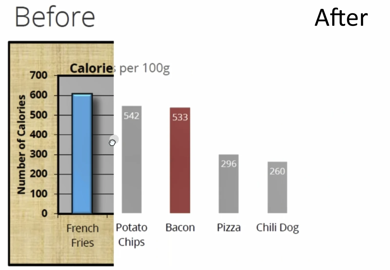
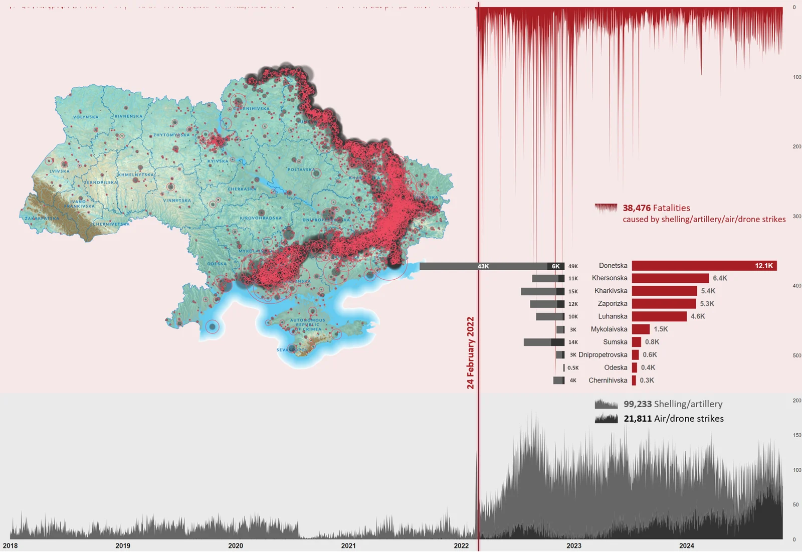
Why do some maps and charts look so chaotic? Often it is the colors: in sequential or rating visuals, mismatched hues puzzle more than they inform.
The idea
On a sequential or rating scale, stop mixing hues. Pick one base color and use its tints: a simple tool turns one color into four balanced shades.
01
Mismatched colors confuse
In sequential or rating visuals, unrelated colors confuse viewers more than they inform.
02
One base, four shades
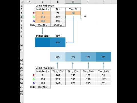
A simple Excel tool by Oleksii Stovpovyi turns a base color into four balanced shades for a cohesive scheme.
03
Lean on brand guidelines
A clear brand book keeps visuals appealing, consistent and professional, and the UNHCR Data Visualization Platform is a great resource worth exploring.
using shades of the same color brings clarity, focus, and elegance to your visuals.

Have you ever looked at a map, chart, or infographic and thought: Why does this color scheme feel so chaotic? Too often, sequential or rating visuals use mismatched colors, leaving viewers more puzzled than informed.
To tackle this, my colleague Oleksii Stovpovyi developed a simple yet powerful Excel tool that makes working with color tints a breeze! Just enter your base color, and voilà - you get 4 perfectly balanced shades to create a cohesive and meaningful color scheme for your data visuals.
Whether you’re mapping data or designing infographics, using shades of the same color brings clarity, focus, and elegance to your visuals.
https://lnkd.in/d7cKJhFi
How do you approach color schemes in your visualizations?
💡P.S. Once you’ve downloaded the file, don’t forget to go to "Properties" and click "Unlock" at the bottom of the Properties window. It’s a macro-enabled Excel workbook, so it might need a little extra permission to run smoothly. And yes, you’ll need to trust me on this one!
Excited to hear your thoughts! If you’d like to jump into the discussion or share your insights, just follow this link, and let’s keep the conversation going:
Having clear guidelines and a brand book is essential for creating visuals that are not only visually appealing but also consistent and professional. They help ensure that charts and graphics communicate effectively while maintaining a unified look and feel.
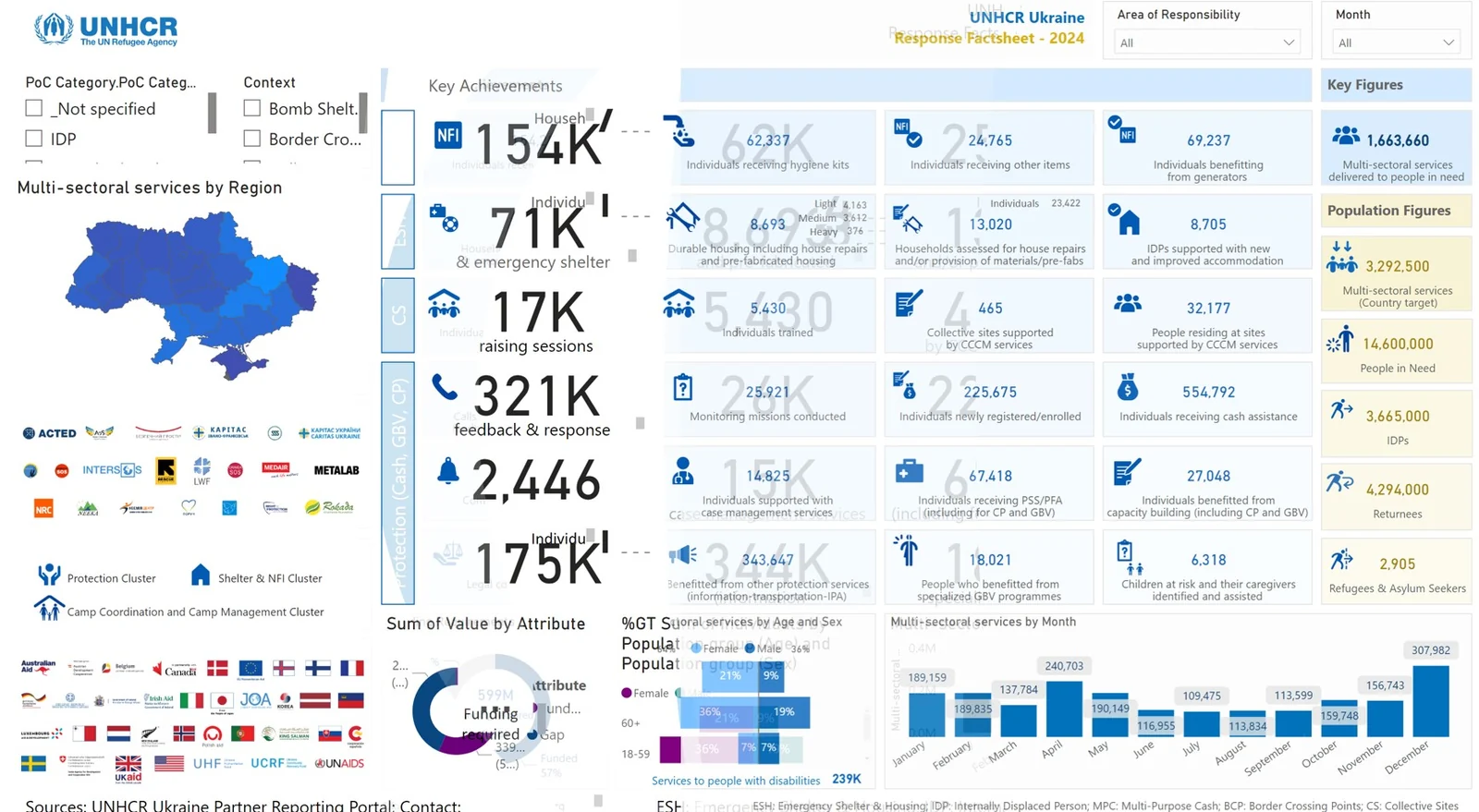
As an example, the UNHCR, the UN Refugee Agency Data Visualization Platform is a great resource: https://dataviz.unhcr.org/
They’re practical, easy to follow, and ensure that visuals are clear, impactful, and brand-compliant. Definitely worth exploring for inspiration!