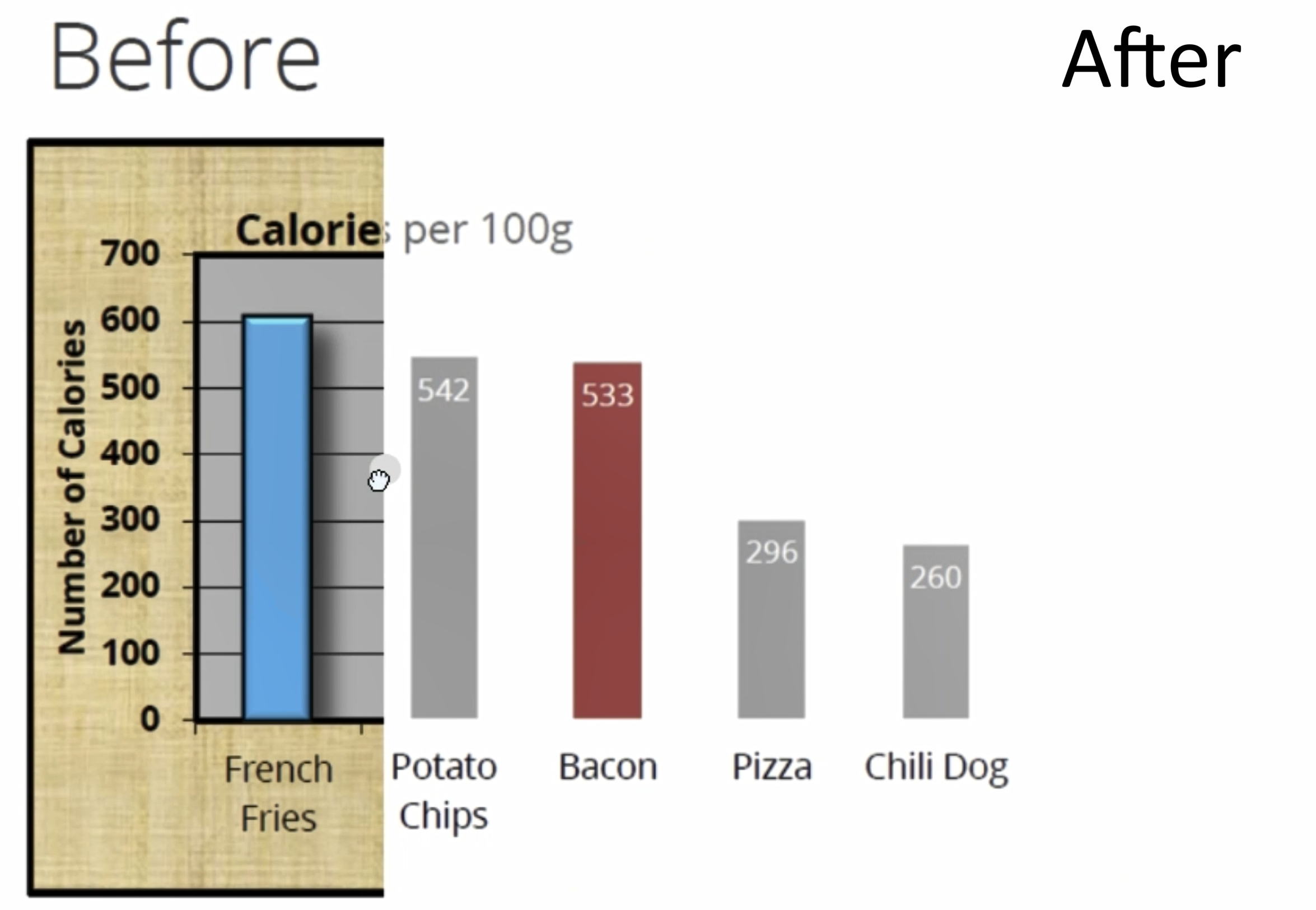
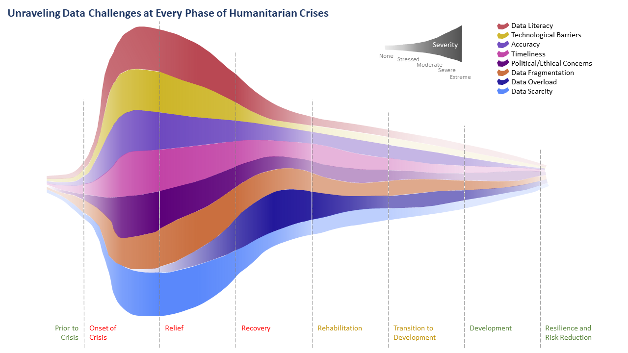
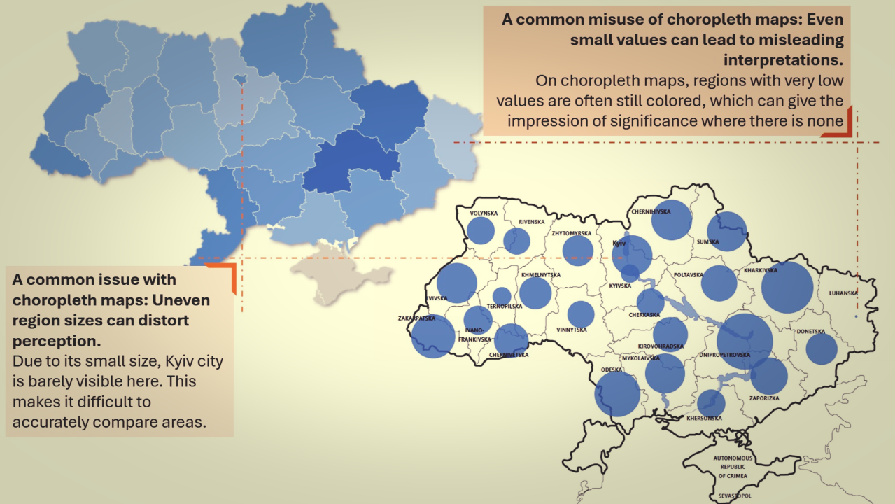
About 10 years ago, I came across the Data Ink Ratio concept from Edward Tufte during data visualization training, and it’s been a game-changer ever since. The idea? Focus only on the “ink” that conveys data and strip out the rest. Think less is more, especially in data storytelling.
In fact, I even discovered the original visual from Darkhorse Analytics (a Canadian gem) and liked it so much, that it became my background image as a constant reminder!
In this quick video, I walk through how to simplify charts using the Data Ink Ratio concept. Let’s declutter our data visuals and make them impactful. Curious – how do you approach simplifying your own data visuals?
Excited to hear your thoughts! If you’d like to jump into the discussion or share your insights, just follow this link, and let’s keep the conversation going:


