5 min read 0 Data Challenges DataViz Never Be the Smartest Person in the Room Alen Chalak February 22, 2025
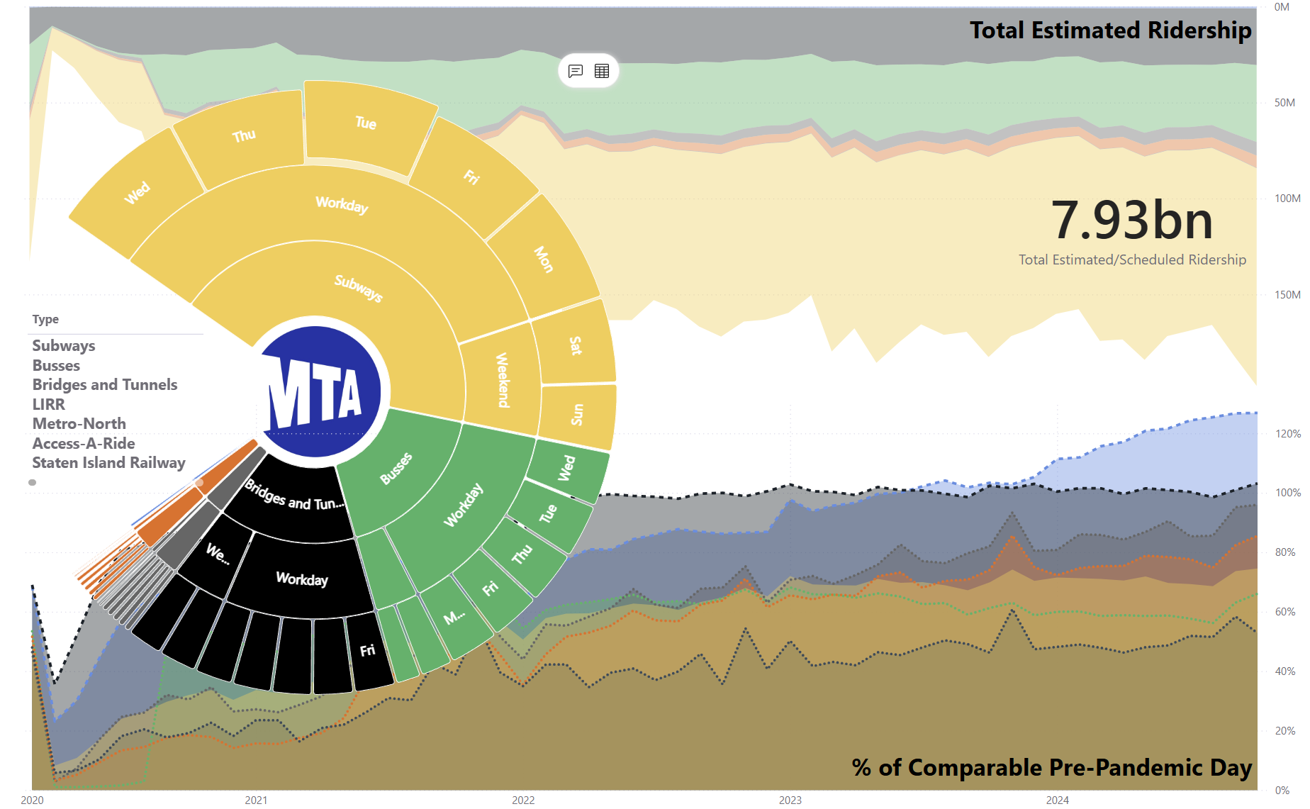
4 min read 0 Data Challenges DataViz From Ordinary to Extraordinary: The Art of Transformative Data Visualization Alen Chalak February 20, 2025
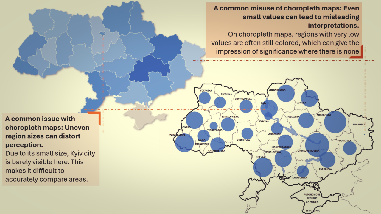
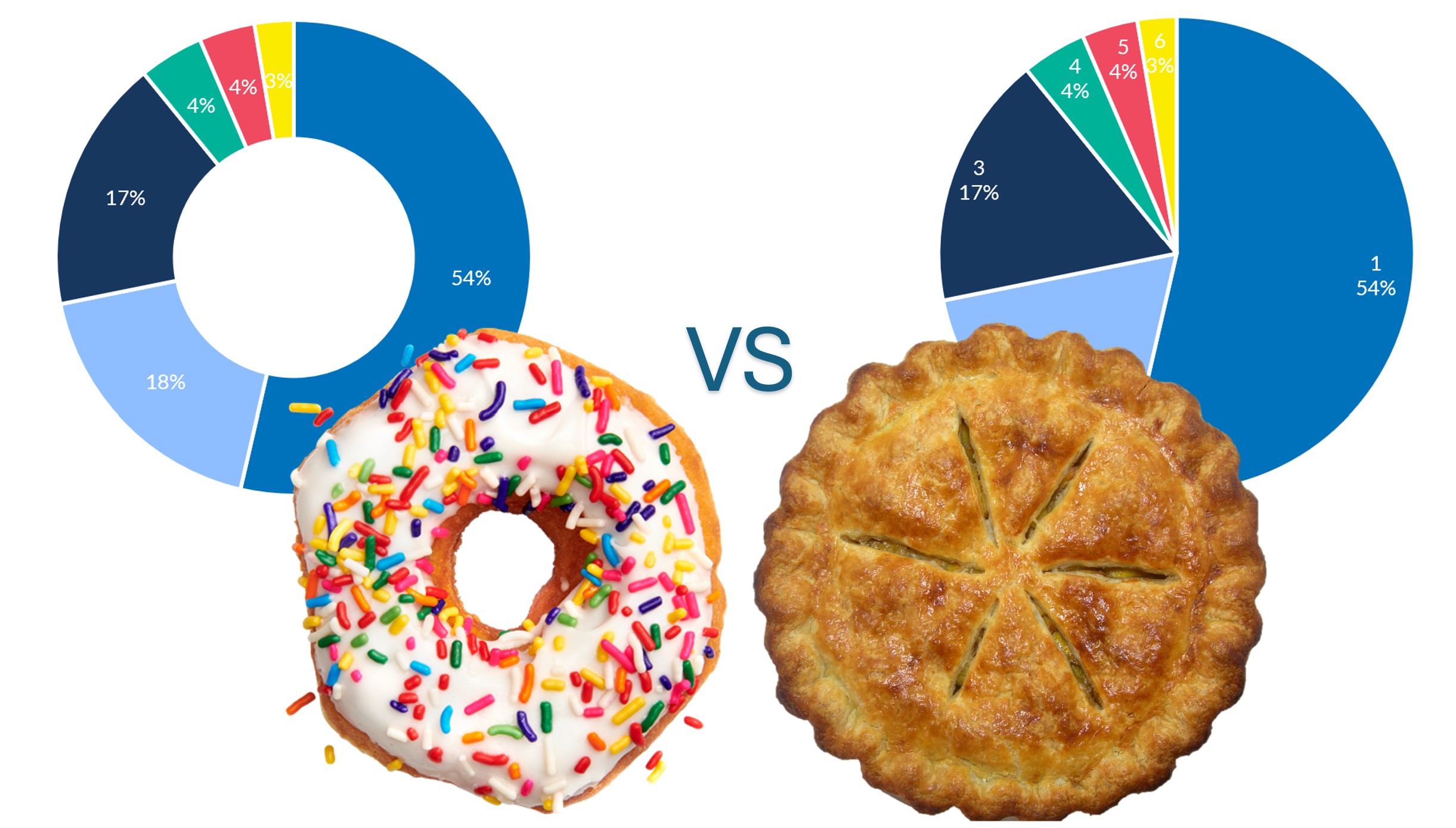
3 min read 0 Data Challenges DataViz Why Your Graph is Lying to You (And How to Fix It) Alen Chalak February 8, 2025
8 min read 0 Data Challenges Beyond the Data – Being Played vs. Being a Player Alen Chalak January 20, 2025
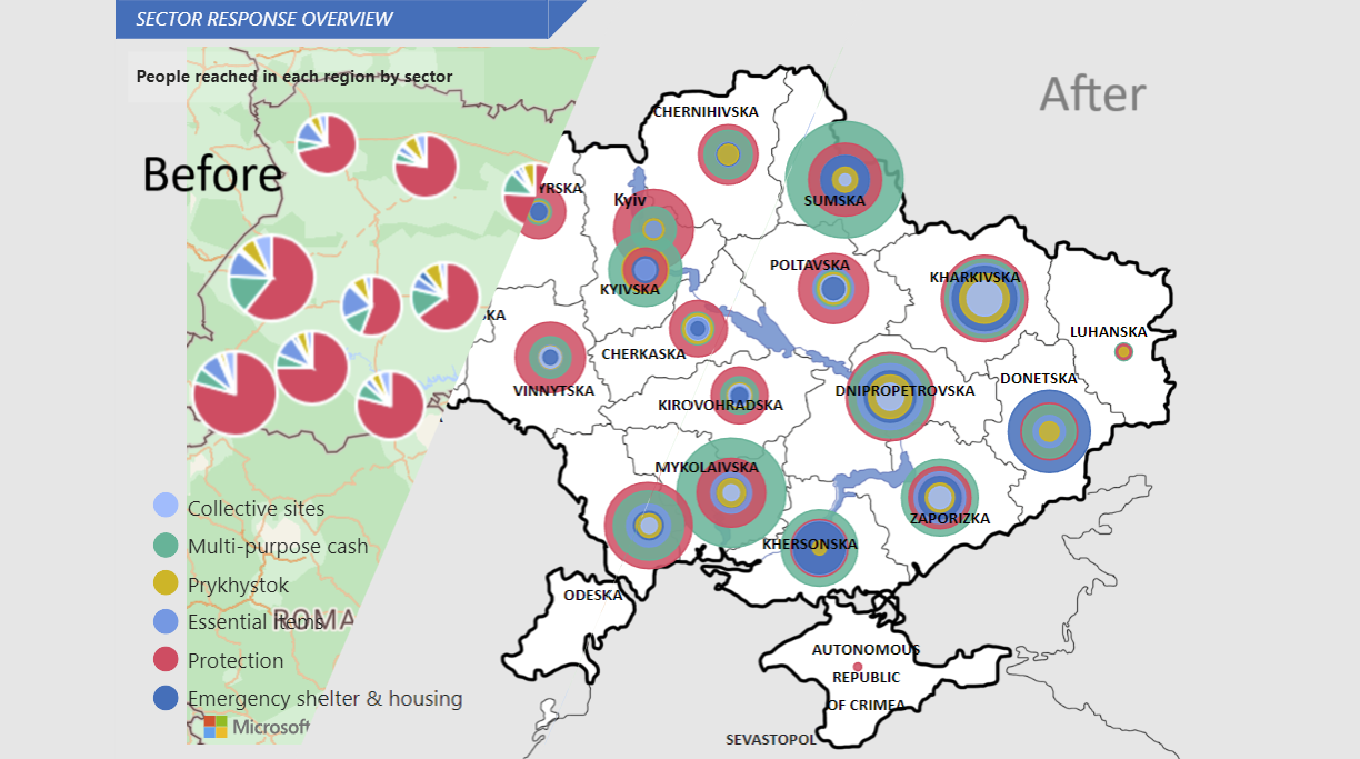
2 min read 0 DataViz Creativity Meets Impact: Data Visualization in Humanitarian Response Alen Chalak January 10, 2025
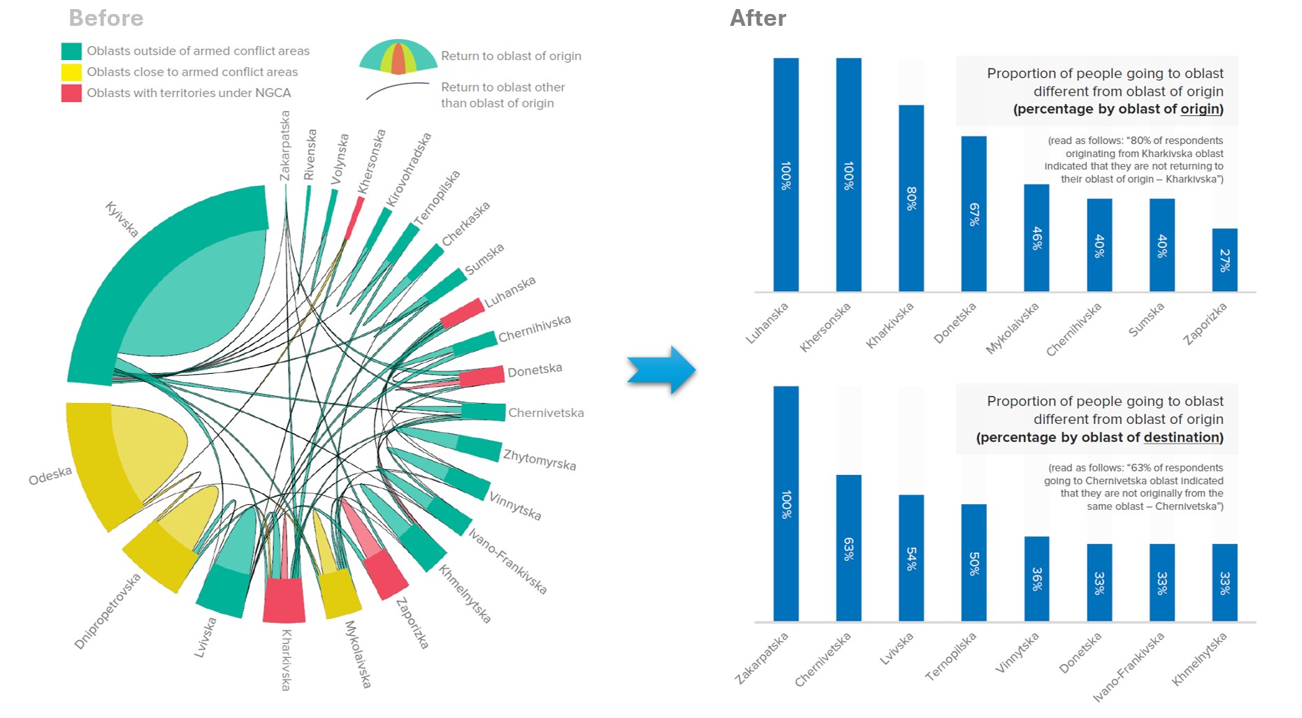
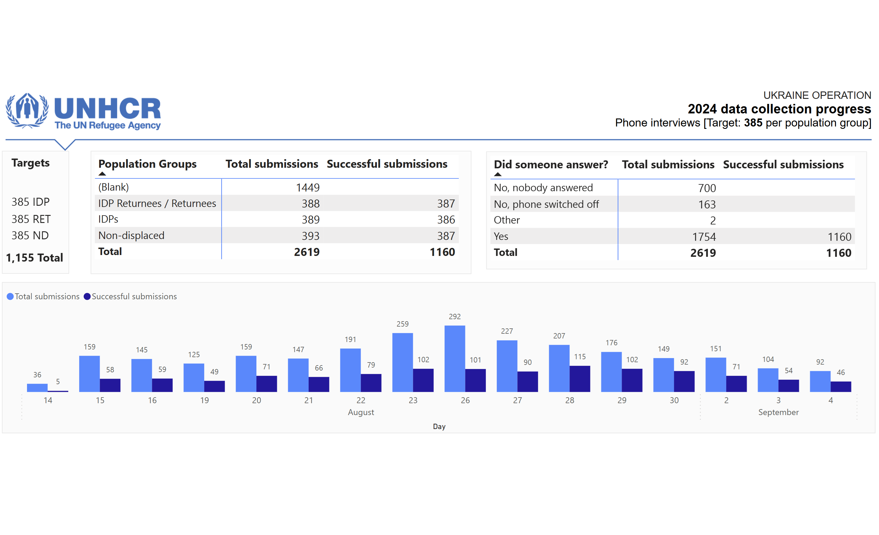
5 min read 0 Data Challenges DataViz The Survey Story: The Failure That Taught Me to Manage Bottlenecks Alen Chalak January 10, 2025
5 min read 0 Data Challenges DataViz Beyond the Data – Never Call Yourself an Expert Alen Chalak December 21, 2024
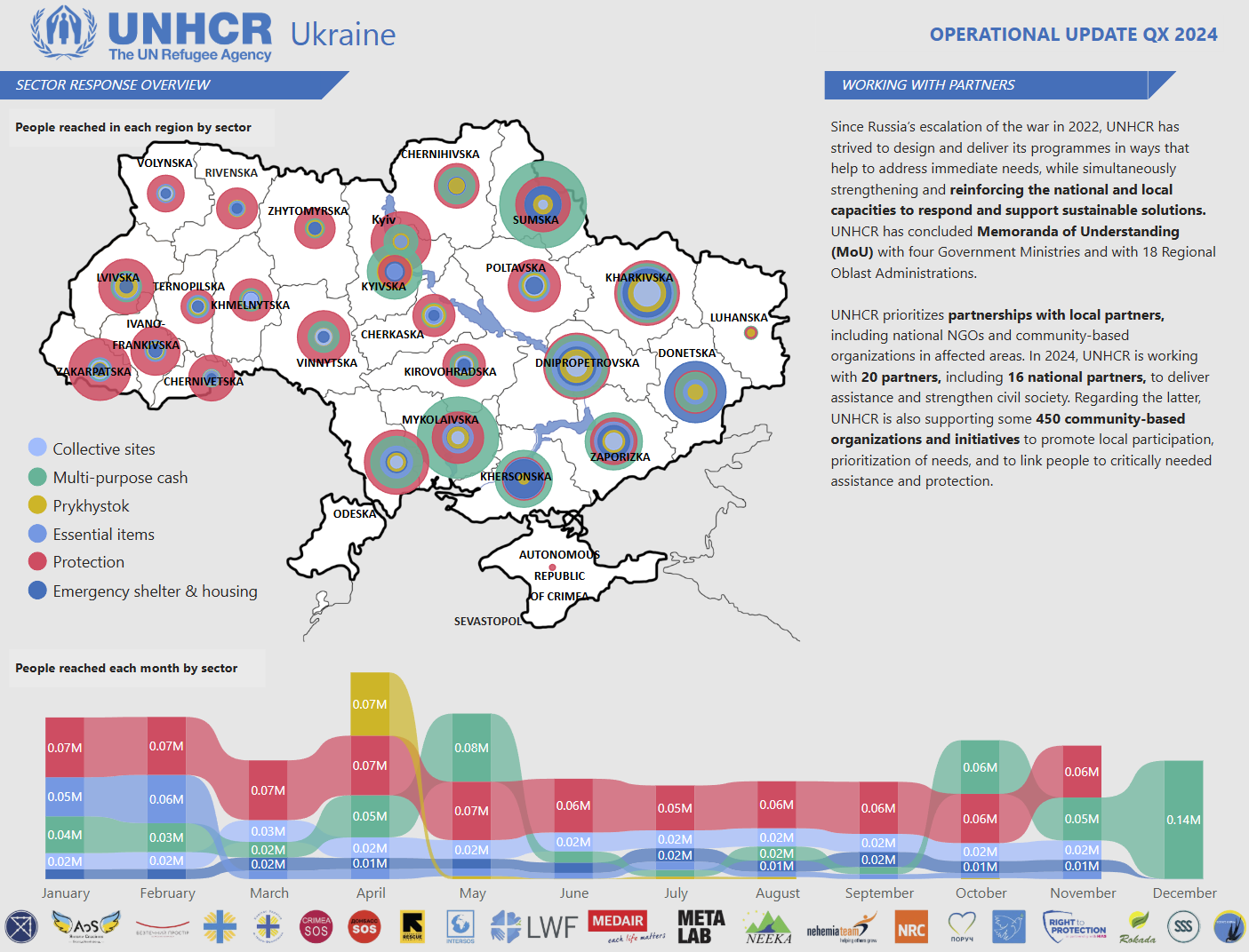
4 min read 0 Data Challenges DataViz Creating Dashboards with Purpose: Serving Diverse Stakeholders with a Single Tool Alen Chalak December 15, 2024
2 min read 0 DataViz Color Tints: Fixing the Chaos in Data Visualization 🎨 Alen Chalak December 7, 2024
2 min read 0 Data Challenges DataViz 🎶 Dancing Data: A Case for Open and Responsible Sharing Alen Chalak December 4, 2024