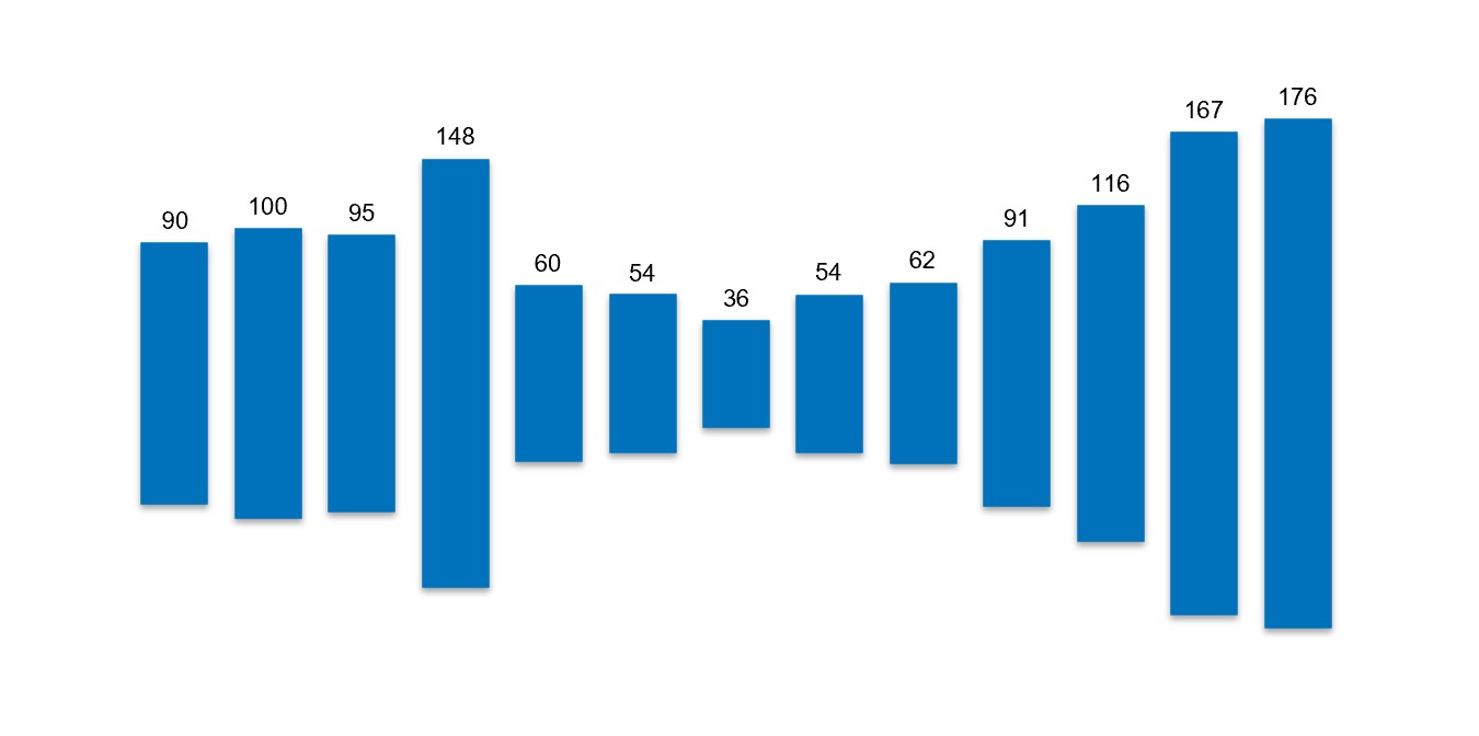
1 min read 0 Data Challenges DataViz Data can dance. But it can also speak. Loudly… Alen Chalak May 25, 2025
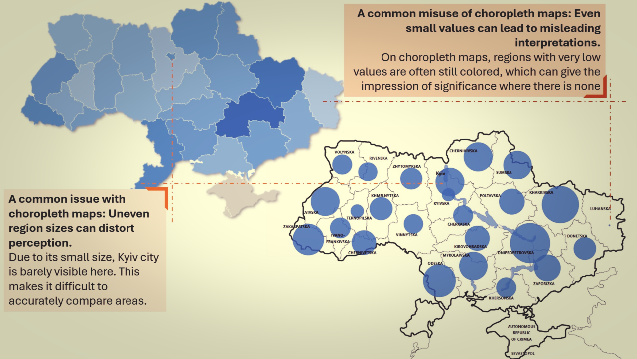
5 min read 0 Data Challenges DataViz Why the Easiest, and Prettiest Map Isn’t Always the Best Map Alen Chalak May 2, 2025
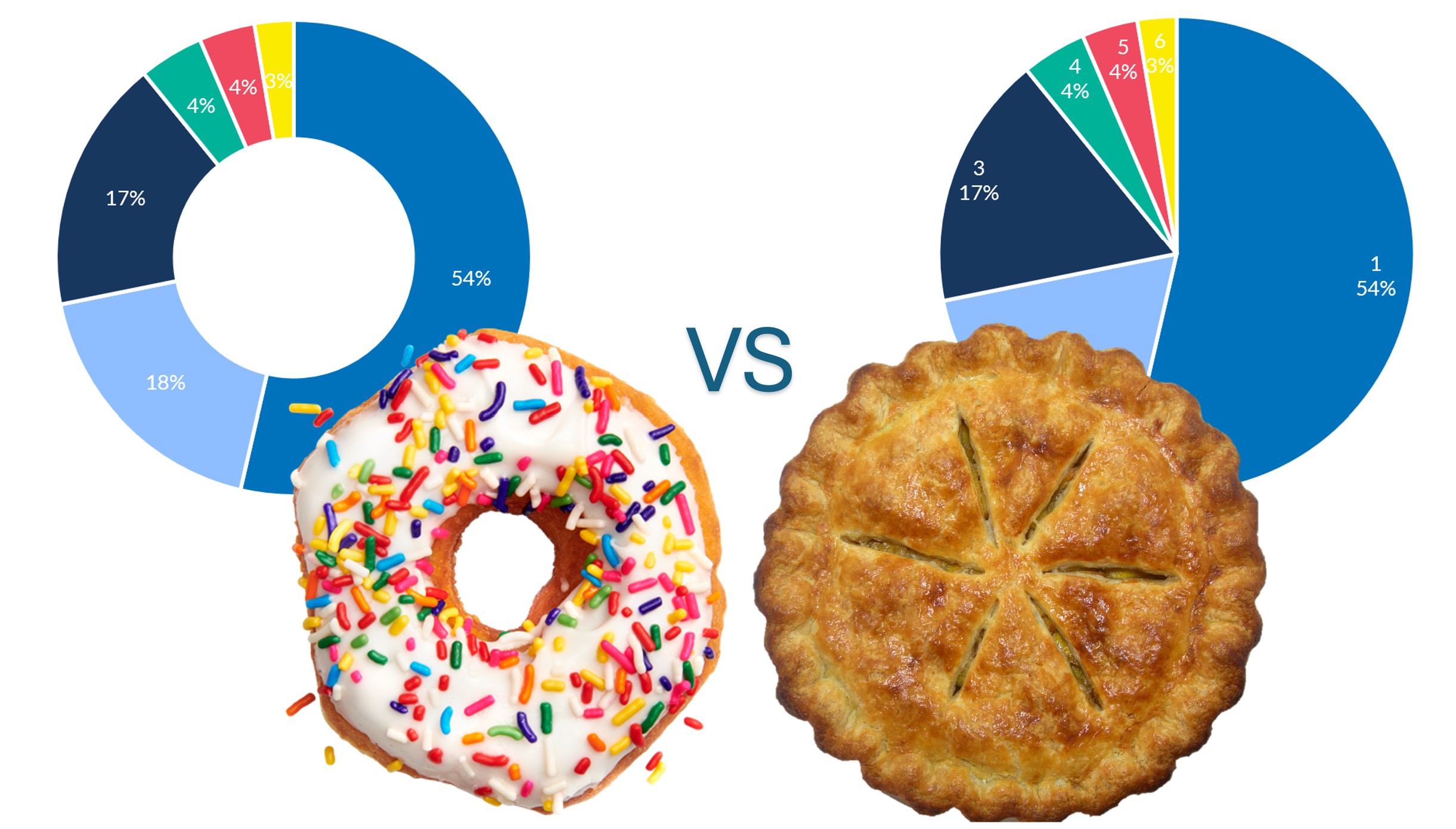
4 min read 0 Data Challenges DataViz When a Donut Chart Shifted the Narrative Alen Chalak April 20, 2025
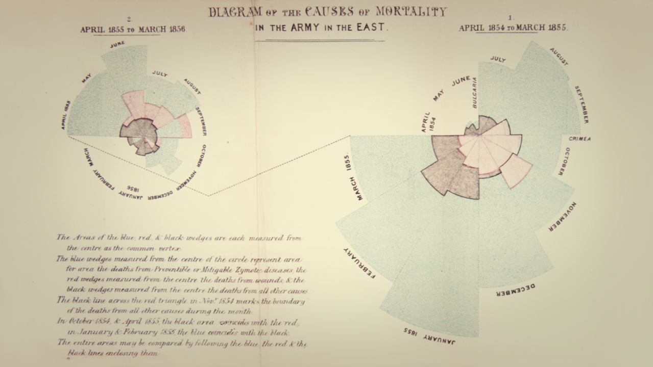
6 min read 0 Data Challenges DataViz The Power of the Right Question: Lessons from History Alen Chalak April 3, 2025
5 min read 0 Data Challenges DataViz Never Be the Smartest Person in the Room Alen Chalak February 22, 2025
4 min read 0 Data Challenges DataViz From Ordinary to Extraordinary: The Art of Transformative Data Visualization Alen Chalak February 20, 2025
3 min read 0 Data Challenges DataViz Why Your Graph is Lying to You (And How to Fix It) Alen Chalak February 8, 2025
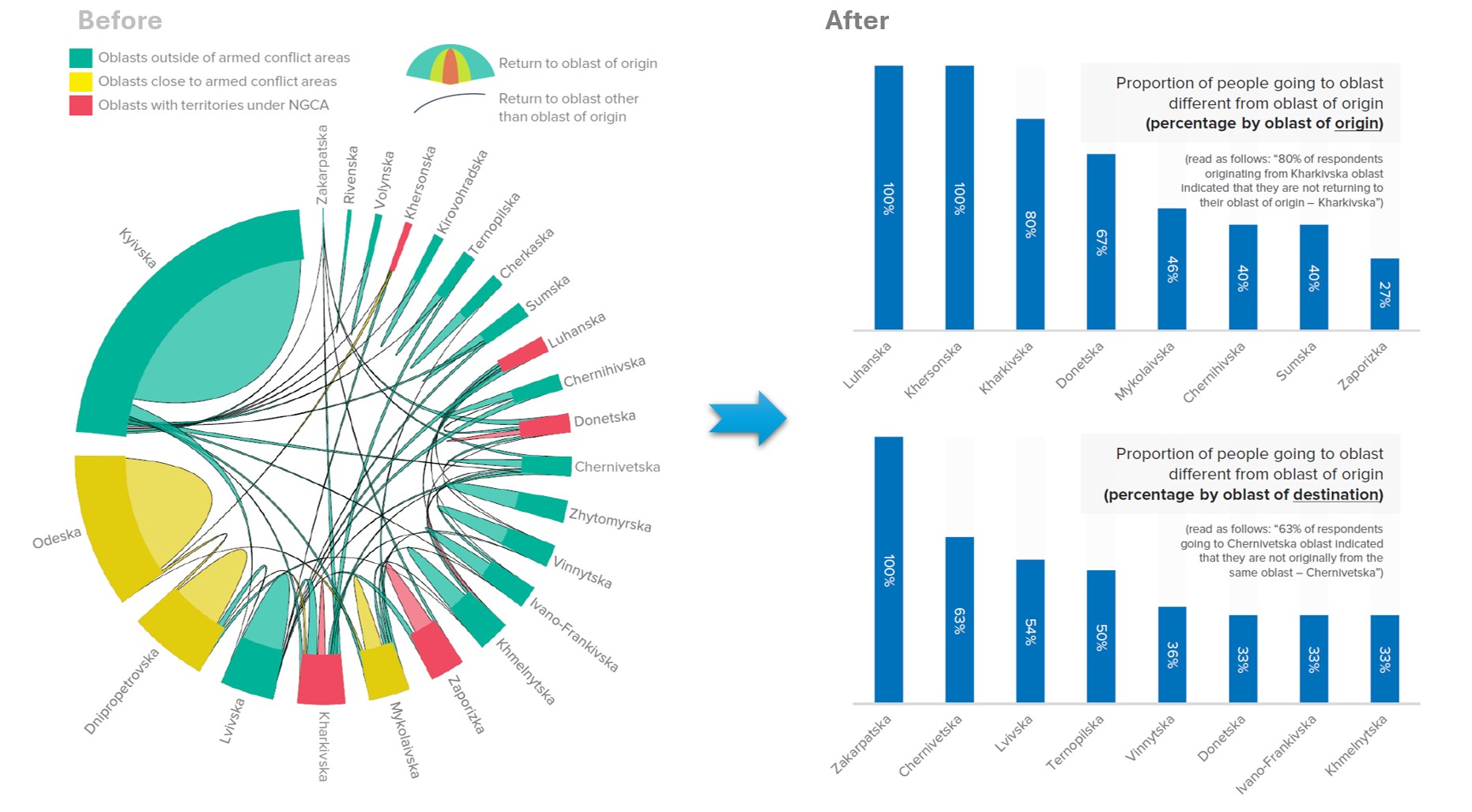
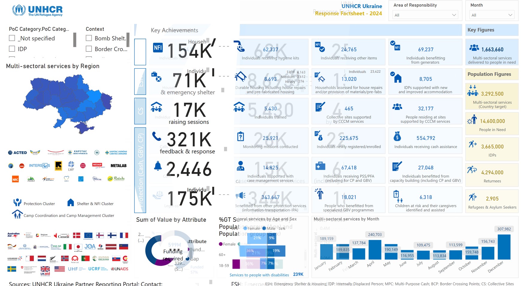
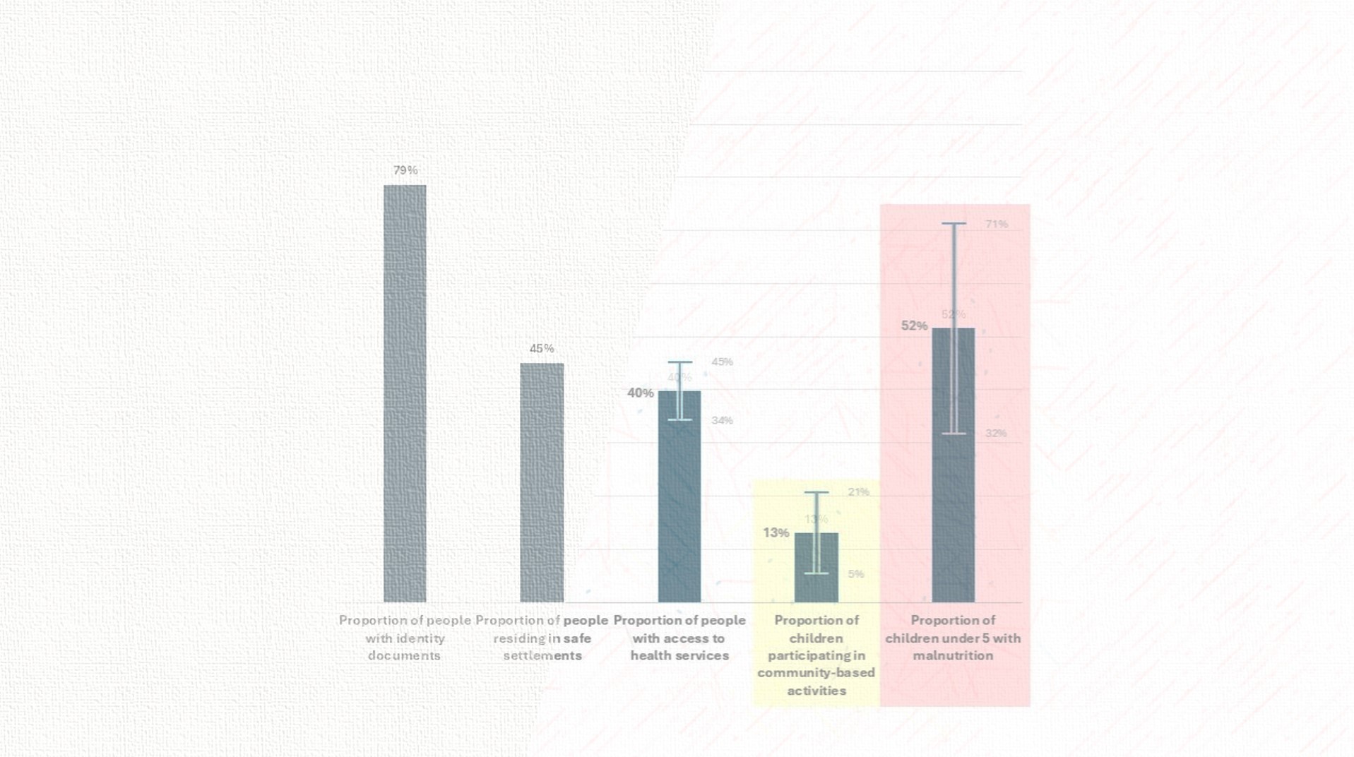
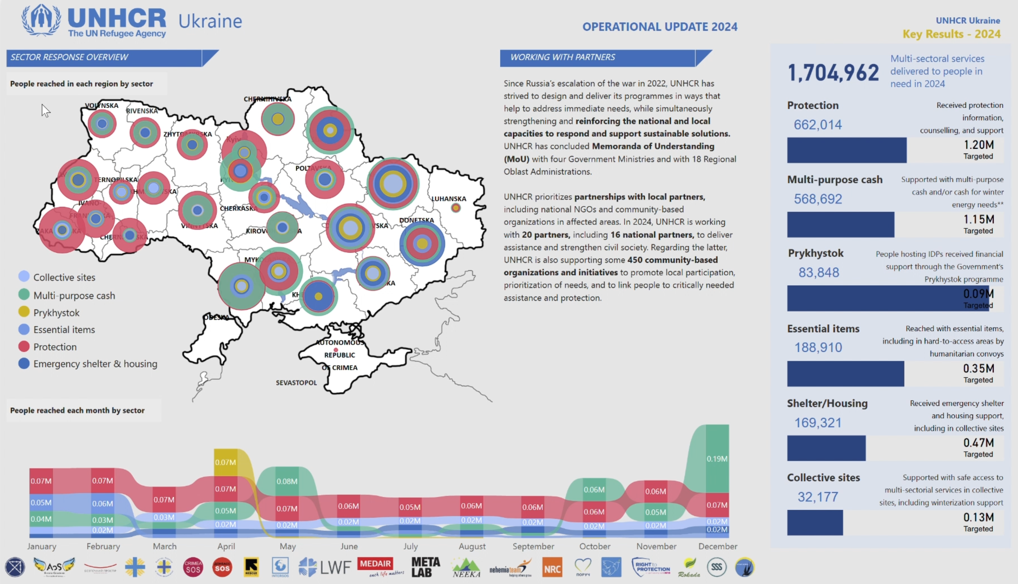
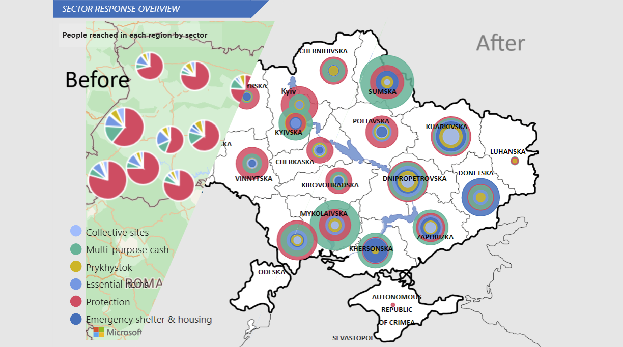
2 min read 0 DataViz Creativity Meets Impact: Data Visualization in Humanitarian Response Alen Chalak January 10, 2025
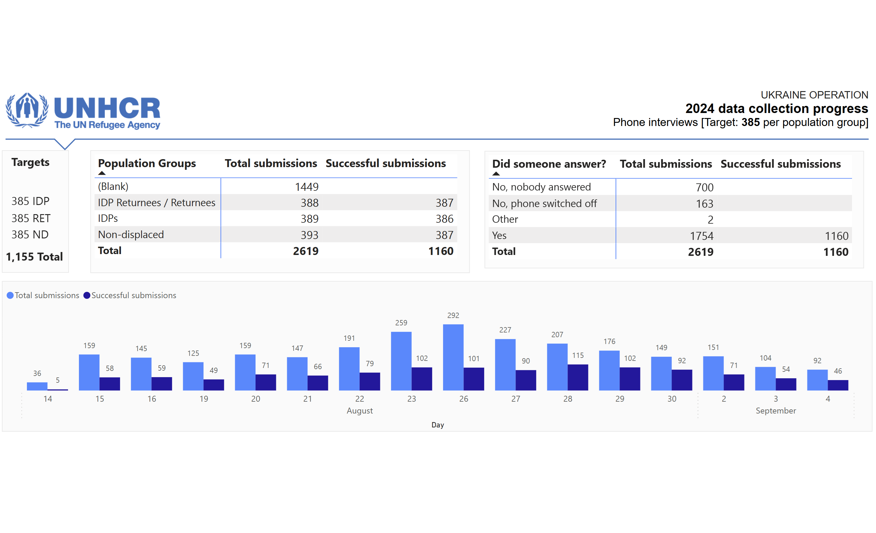
5 min read 0 Data Challenges DataViz The Survey Story: The Failure That Taught Me to Manage Bottlenecks Alen Chalak January 10, 2025
5 min read 0 Data Challenges DataViz Beyond the Data – Never Call Yourself an Expert Alen Chalak December 21, 2024