The Default Trap: Why Some Dashboards Fail to Inspire
We’ve all encountered them – dashboards brimming with numbers, charts, and tables that leave us disengaged. The data is there, the insights buried within, yet something is missing. Data visualization isn’t just about displaying information; it’s about making data speak with clarity and purpose.
The journey to effective decision-making doesn’t start with visuals – it begins with data collection, analysis, insight extraction, and the formulation of solutions. After all that effort, failing at the visualization stage is not an option. Default settings and cookie-cutter templates limit the potential of our insights. To create dashboards that truly resonate, we must go the extra mile, leveraging the power of aesthetic precision to transform information into impact.
Before & After: A Visual Transformation
To illustrate this, let’s examine three side-by-side comparisons of dashboards I’ve worked on. Each transformation highlights how small yet thoughtful visual adjustments can elevate a dashboard from mundane to magnificent.
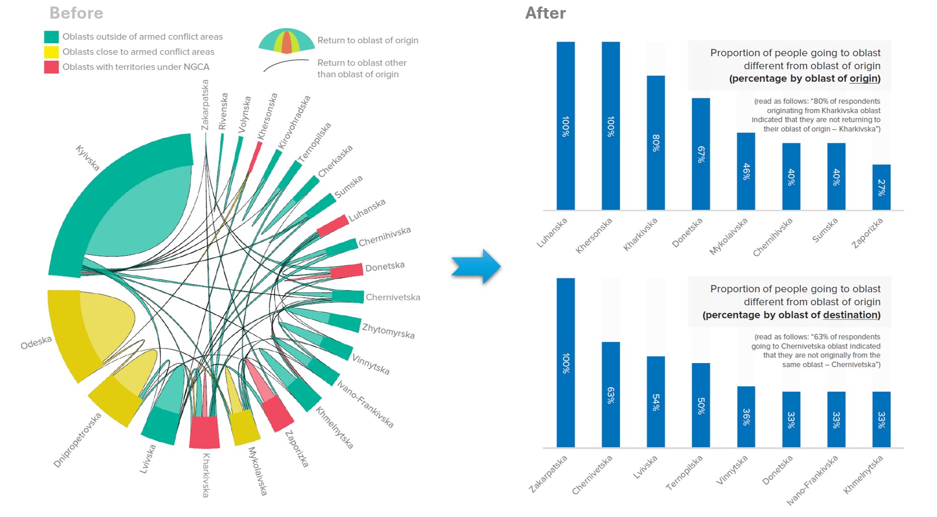
.:. First Example: From a cluttered table to an intuitive, easy-to-read dashboard
The original design was an overwhelming sea of numbers – difficult to scan, and frustrating to interpret. Without proper spacing, structure, or visual cues, extracting key insights felt like solving a puzzle. The solution? A refined layout with clear headings, strategic tinting, and whitespace to create breathing room. The once-dense table evolved into an intuitive, visually structured dashboard where users could instantly grasp key takeaways.

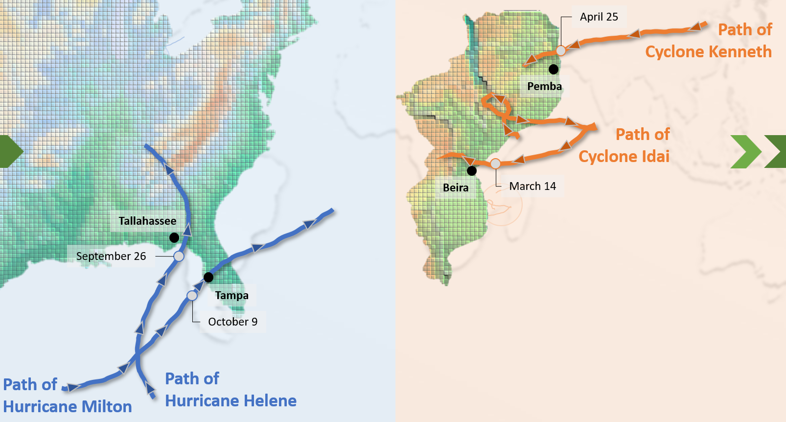
:.: Second Example: From a chaotic layout to a seamless visual story
Initially, the dashboard lacked hierarchy – charts and graphs competed for attention, resulting in a cluttered and disconnected experience. The redesigned version embraced visual storytelling: arranging elements in a logical flow, introducing geographic context, and structuring content in a way that guides the reader’s eye. The end result? A dashboard that doesn’t just present data – it tells a compelling narrative.
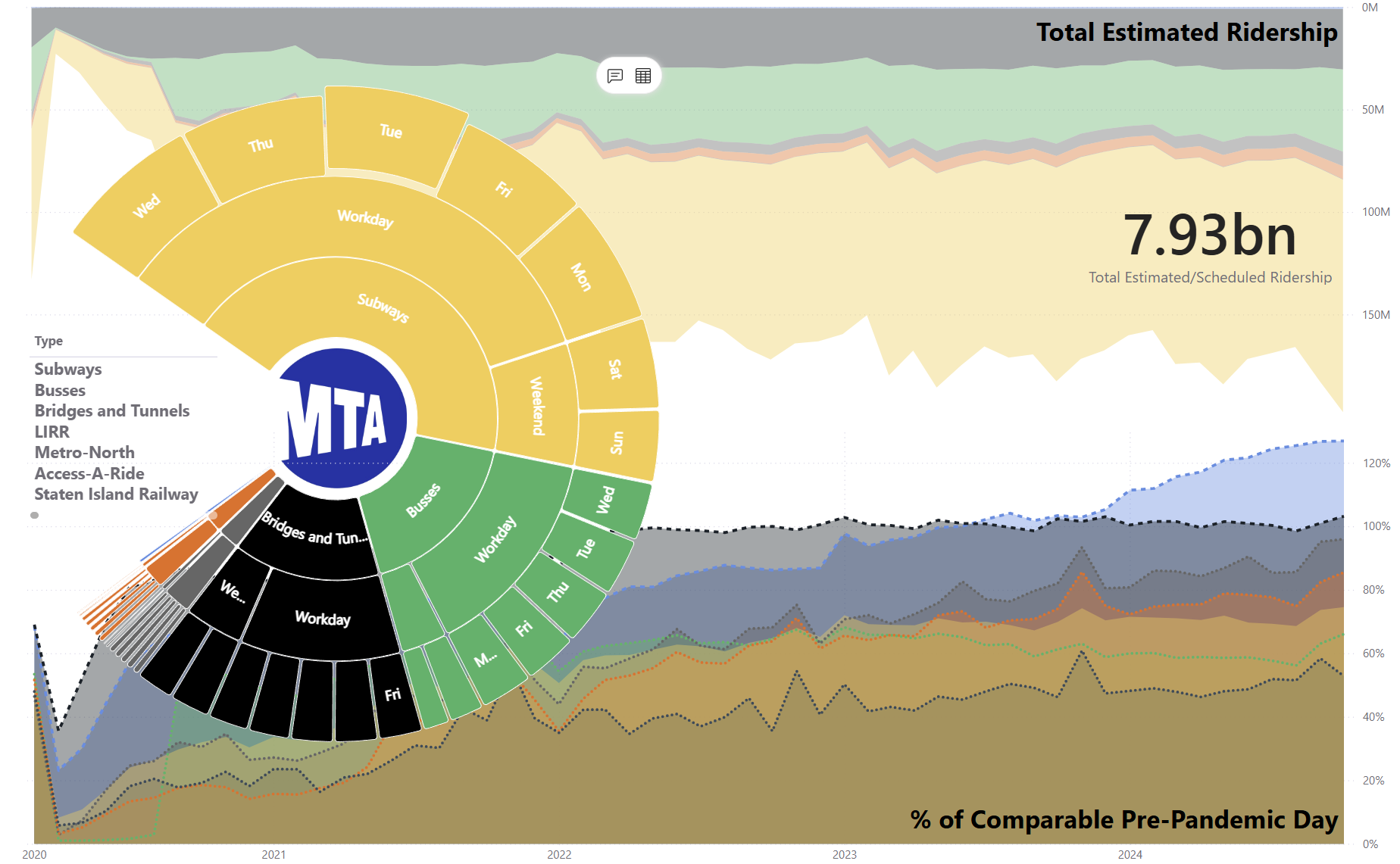
::: Third Example: From inconsistent design to a user-focused experience
The original dashboard suffered from inconsistent font sizes, jarring color choices, and an overall lack of refinement. Users found themselves straining to read and struggling to focus. By standardizing typography, refining contrast, and thoughtfully applying color, the new version transformed into a user-friendly, visually engaging experience. The data became not just readable, but irresistible.
These examples prove an important point: the data didn’t change – only the design did. The difference is not in the numbers but in how they are presented.
Why Aesthetic Design in Data Visualization Matters
Great data visualization is not just about numbers – it’s about experience. Why does aesthetic design matter in dashboards?
::.:: Trust & Credibility: Well-designed visuals enhance credibility. A professional, polished dashboard fosters confidence in the data it presents.
:::.: User Experience (UX): Just as a well-structured website keeps visitors engaged, an intuitive dashboard keeps users focused on insights rather than struggling to decipher them.
:.:.: Data Storytelling: A dashboard should do more than just display numbers; it should narrate a story. Thoughtful design ensures that the most critical insights stand out, guiding decision-makers effortlessly.
Key Visualization Techniques That Elevate Dashboards
The transformations showcased earlier used the same dataset – yet the refined visuals tell a completely different story. This proves that thoughtful design techniques can elevate even the most ordinary data into something extraordinary.
There are specific methods that transform dashboards from functional to phenomenal. In upcoming articles, I will break down these techniques in detail, explaining how subtle refinements can drive a major impact.
Typography & Hierarchy – The role of fonts, sizes, and colors in creating clarity.
Borders & Spacing – How alignment and separation enhance readability.
Background & Contrast – Using colors to improve focus and engagement.
Tint & Shading Techniques – Breaking monotony while maintaining consistency.
Structure & Layout – Designing with flow to optimize user interaction.
Each of these techniques, when applied deliberately, turns an ordinary visualization into an extraordinary one.
The Takeaway: Design with Purpose
Data should never be confined to default settings. By meticulously refining every visual element, we transform dashboards from basic tools into indispensable assets – captivating, intuitive, and impossible to overlook.
In the next articles, I’ll break down these techniques with real-world examples, demonstrating how minor adjustments lead to major impact. Stay tuned!
-> Which aspect of dashboard design do you find most challenging?