Surveys are critical tools in the humanitarian field. They provide data that guides decisions impacting lives. But surveys are also resource-intensive and time-sensitive. This article is about one such survey that I led – a complex exercise that taught me lessons I’ll never forget.
The survey aimed to measure several indicators across multiple levels, including households and individuals. Among these indicators, one of the trickiest was the ratio of documentation for children under 5 years old. It seemed straightforward at first, but it turned out to be the survey’s bottleneck – a concept borrowed from Eliyahu Goldratt’s business novel “Critical Chain”.
The Magic Number and the Sampling Plan
Like most surveys, we were constrained by budget and time. In humanitarian settings, these constraints are constants. To balance quality and resources, we agreed to the standard parameters: a 95% confidence level and a 5% margin of error. These parameters gave us a target sample size of 385 households – the magic number. Why magic? Because regardless of whether your population size is 100,000 or 10 million, the required sample size for these parameters remains largely the same – 385.
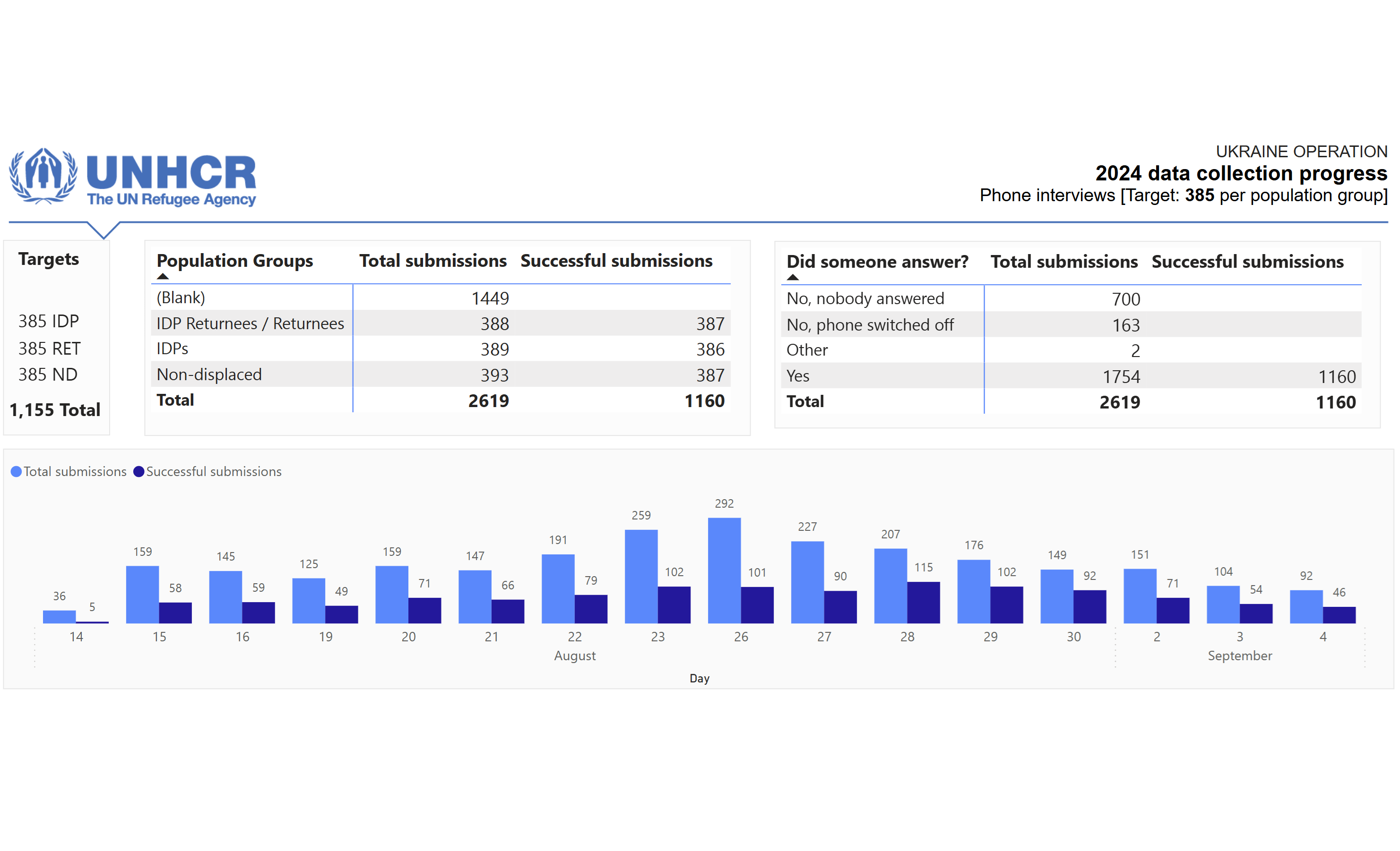
Our sampling methodology was reviewed and approved by several experts. With everything in place, we launched the survey. To ensure progress was tracked efficiently, I developed a dashboard that provided real-time updates to project coordinators and managers. It flagged delays and highlighted areas needing corrective action.
Things were going well – or so it seemed.
The Bottleneck Revealed
Halfway through the data collection, I began calculating the indicators to track progress and ensure data quality. Most indicators looked fine. However, when I got to the indicator measuring documentation for children under 5, I froze. Out of the 200 households surveyed so far, only 30 had children in this age group. This meant that by the survey’s end, we’d likely have data for only 60–65 children – far fewer than needed to maintain our intended confidence level and margin of error. Sure, lately there were number of articles on the media about the lowest ever fertility rate in Ukraine globally. I knew it, but I did not incorporate it into the design phase of the survey.
Mathematically, this translated to a confidence level of 90% and a margin of error of 10%. While this may seem like a minor difference to some, as a data manager, I knew it wasn’t good enough to make sound decisions and conclusions. This indicator had become the survey’s bottleneck, limiting the overall quality of the data.
The Constraints and Bottlenecks in Surveys
Goldratt’s “Critical Chain” highlights two key concepts: constraints and bottlenecks. In the context of humanitarian surveys:
- Constraints are the overarching limitations, such as budget, time, and resources. These are the factors you must plan around from the beginning.
- Bottlenecks are the points in your process that slow everything else down. For us, it was the indicator on children under 5.
While constraints are predictable, bottlenecks often reveal themselves during execution – and they can have a cascading impact if not addressed promptly.
The Lesson Learned
This experience taught me a critical lesson: it’s not enough to design a survey that works for most indicators. You must design with all indicators in mind. Here’s how I’ve adapted my approach since:
- Understand the Purpose: Before designing a survey, study its primary objectives in detail. Pay close attention to the indicators, especially those with unique requirements or constraints.
- Plan for Bottlenecks: During the design phase, identify potential bottlenecks and explore methods to address them. For example, snowball sampling can help gather data for rare indicators.
- Communicate Data Limitations: Transparency is key. If limitations exist, ensure they’re communicated clearly to stakeholders upfront. This builds trust and sets realistic expectations.
- Track Progress Early: Real-time dashboards are invaluable. They allow for mid-course corrections and prevent issues from escalating. In the image posted, I did not include anything on particular indicators, specially on children below 5. Certainly my bad. Smart thing is to have the progress report for each indicator and have red flags as early as possible.
- Visualize Nuances: incorporate confidence levels and margins of error directly into data visualizations. It’s a small detail, but it makes a big difference in ensuring transparency and accuracy. Stay tuned, I am thinking of a new article on this particular point.
A Harsh Reality: Fertility Rates and Data Gaps
One additional factor that complicated this survey was Ukraine’s historically low fertility rate. This wasn’t just a statistical reality – it was a harsh reminder of the broader socio-economic challenges the country faces. This context further emphasized the importance of considering external factors when designing surveys and interpreting their results.
Moving Forward
This failure wasn’t just a stumble; it was a turning point. It reshaped how I approach survey design and data management. Now, for every survey, I start by asking: What are the constraints? What could be the bottlenecks? How can I address them proactively?
In the end, sharing failures isn’t just about being vulnerable – it’s about being useful. It’s about turning a mistake into a lesson that others can learn from.
Excited to hear your thoughts! If you’d like to jump into the discussion or share your insights, just follow this link, and let’s keep the conversation going:


