What aesthetics, real-world constraints, and evolving practice taught me about rethinking “standard” map types.
If you work long enough in data visualization, you quickly realize: Not every beautiful chart in theory survives the messy realities of practice.
Recently, while preparing a set of visualizations for a report, I found myself at such a crossroads. A simple request: “We need a map.”
The team had used a choropleth map previously – one of the most common ways to visualize geographical data. So naturally, I tried starting there.
But something felt… off.
Choropleth Maps: Powerful, but with Real-World Limits
Choropleth maps, by definition, color geographic regions according to a value – darker or lighter, bigger or smaller. They can be highly effective for showing geographical patterns. As the UNHCR, the UN Refugee Agency Data Visualization Platform puts it:
“Choropleth maps are great to show geographical patterns in the data. If the data doesn’t show a clear geographical pattern, consider another chart type for the data. Choropleth maps work best when geographic regions are fairly consistent in size. Otherwise, larger areas appear more emphasized, which could result in misinterpretation.”
And that’s exactly where the problem started.
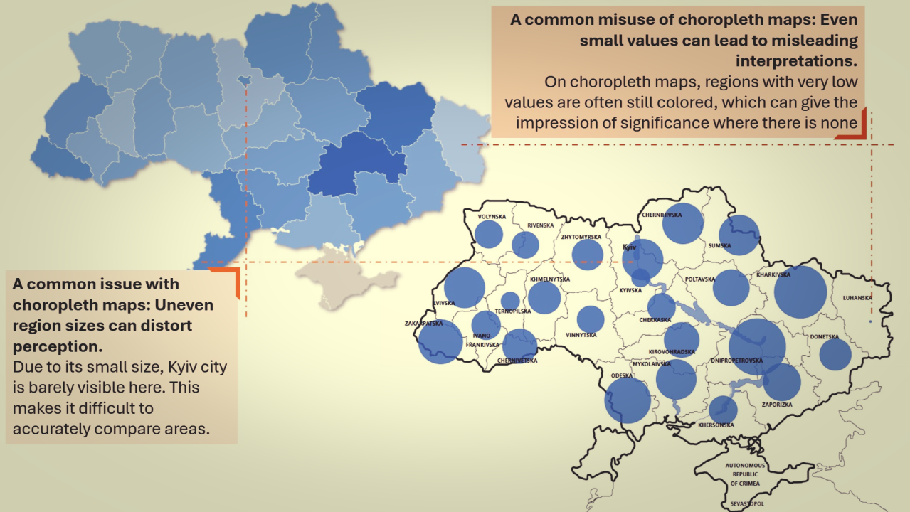
In practice, in most country operations, geographic regions are not consistent in size. For instance, capital and other major cities are often tiny Admin 1 units, surrounded by vast provinces or regions. A choropleth can unintentionally mislead: huge regions with small numbers look visually dominant, while dense urban centers with massive needs appear almost invisible.
At the same time, there’s another reality we can’t ignore:
In the majority of modern tools, creating choropleth maps is extremely easy. Four or five clicks. Pick a shape file. Pick a measure. Pick a color scale. Done. A clean, beautiful choropleth map appears. Technically perfect.

But wait a second.
Is our goal just to create something easy and nice-looking? What about the message behind it? What about ensuring there are a limited number of meaningful categories? What about the fundamental need for fairly consistent region sizes?
Too often, the visual beauty of a choropleth tricks even us, the creators, into feeling like the work is done. Our brain can be distracted by the aesthetics and miss the deeper truth: that we might be breaking key principles of effective, honest visualization.

Bubble (Proportional Symbol) Maps: An Underused Ally
Switching to a proportional symbol map, in most cases known as a bubble map, offered a different path.
As per UNHCR’s guidance:
“The bubble map can be effective when analyzing and comparing a particular variable by geographical location. For example, displaying the number of refugees by country of asylum on a bubble map can provide useful insights on international displacement.”
I fully agree – and would even go a step further.
Through experience, I found bubble maps are extremely powerful when dealing with a limited set of categories or key indicators.
For example:
:. One bubble for people in need (say, red)
.: Overlaid with a second bubble for people reached (say, blue)
One map. Two related numbers. An immediate, visual identification of the gap.

It’s simple, elegant, and importantly, it doesn’t punish small administrative areas for being small. It lets the data, not the size of the territory, speak.
This wasn’t a realization that came overnight.
A few years ago, while working in Power BI, I experimented with simplifying humanitarian mapping, moving away from standard GIS-heavy maps. Instead of relying on complex map visuals, I combined a tailored map background with simple scatterplots to represent magnitude across locations. Initially, it took more time to create these types of visuals, but once you master the concept of reusability, it no longer requires significant additional effort to create new ones for other purposes.
This minimalist, non-standard approach, which I first shared in my article Never Aim to Become an Expert, ended up receiving strong feedback from colleagues. Today, it’s gratifying to see this technique being adopted more widely across operations and even by peers in other humanitarian agencies.
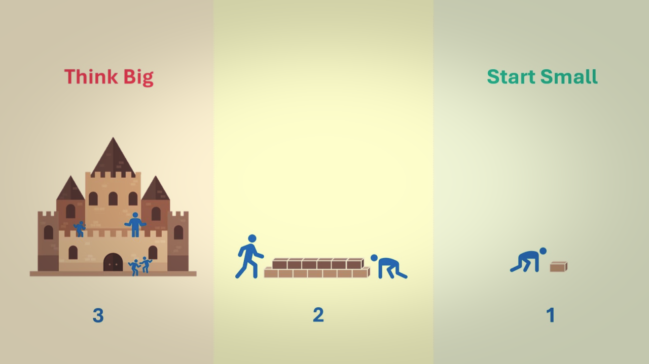
It reminded me again that sometimes the best solutions come not from pushing the tools to their maximum, but from stripping them down to their essentials.
From Theory to Practice: Making the Switch
When I shifted the map from choropleth to bubble:
:.: The heavy imbalance between regions disappeared.
.:. Urban centers got appropriate visual attention.
::: Comparing needs across regions became faster and more intuitive.
Even better: the stakeholders immediately grasped key patterns without needing long explanations.
It wasn’t just prettier. It was more honest to the story the data was trying to tell.
My Evolved Take on Map Choices
Based on theory, experience, and resources like the UNHCR Data Visualization Platform, here’s where I land:
Choropleth Maps: Best when you have a true, strong geographical pattern and fairly consistent region sizes. Otherwise, risk of misinterpretation is real.
Bubble Maps: Best when you want to highlight amounts or relationships clearly, regardless of region size. Especially powerful when showing two related measures together.
PS: Now, it’s hard for me to understand why the Choropleth Map still comes first on the list under both the Financial Times Visual Vocabulary and UNHCR’s Data Visualization Platform for the Spatial/Geospatial category.