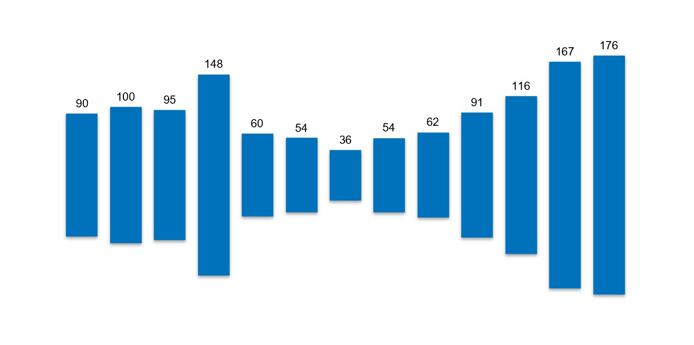
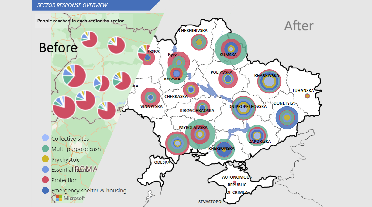
In this short video, I explore how data visualization can sometimes distract us from the story behind the numbers. What starts as a playful animation of column charts turns into a scary reminder of the ongoing attacks on Ukraine’s energy infrastructure.
Using data from ACLED, I visualized the quarterly impact of these attacks, and how this information helps to guide the deployment of generators and portable power stations across the country.
Data can dance. But it can also speak. Loudly…