What aesthetics, evolution, and experience taught me about bending data viz “rules” – and when a donut is better than a pie.
If you’ve spent enough time around data visualization experts, you’ll hear it often:
❌ Avoid pie charts
❌ Don’t use donuts either
And yes – I get it. In most cases, bar charts win for clarity and comparison. Pie charts, especially with too many slices, can confuse more than they communicate.
But not long ago, I had an experience that made me pause and reflect on that advice, and think about how we evolve in our practice. It reminded me of the concept of Shu-Ha-Ri, which I wrote about some time ago:
::: Shu – follow the rules
:.: Ha – break the rules
.:. Ri – transcend the rules
Let me explain.
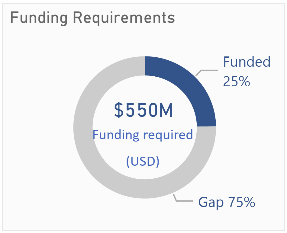
The Case: Funding Requirement and Gap
For one of my data visualizations, I followed the FT Visual Vocabulary quite closely.
Here’s what they say about donut and pie charts:
Pie – A common way of showing part-to-whole data – but be aware that it’s difficult to accurately compare the size of the segments.
Donut – Similar to a pie chart – but the centre can be a good way of making space to include more information about the data (e.g., total).
I had just two categories – Funded and Gap. A classic part-to-whole case. Using a donut chart, I was able to leverage the center space to add key context and totals. It worked well, and aligned perfectly with FT’s guidance. All good.
In general, I still avoided pie and donut charts for most of my other work.
Until recently.
A Design Choice That Prompted Rethinking
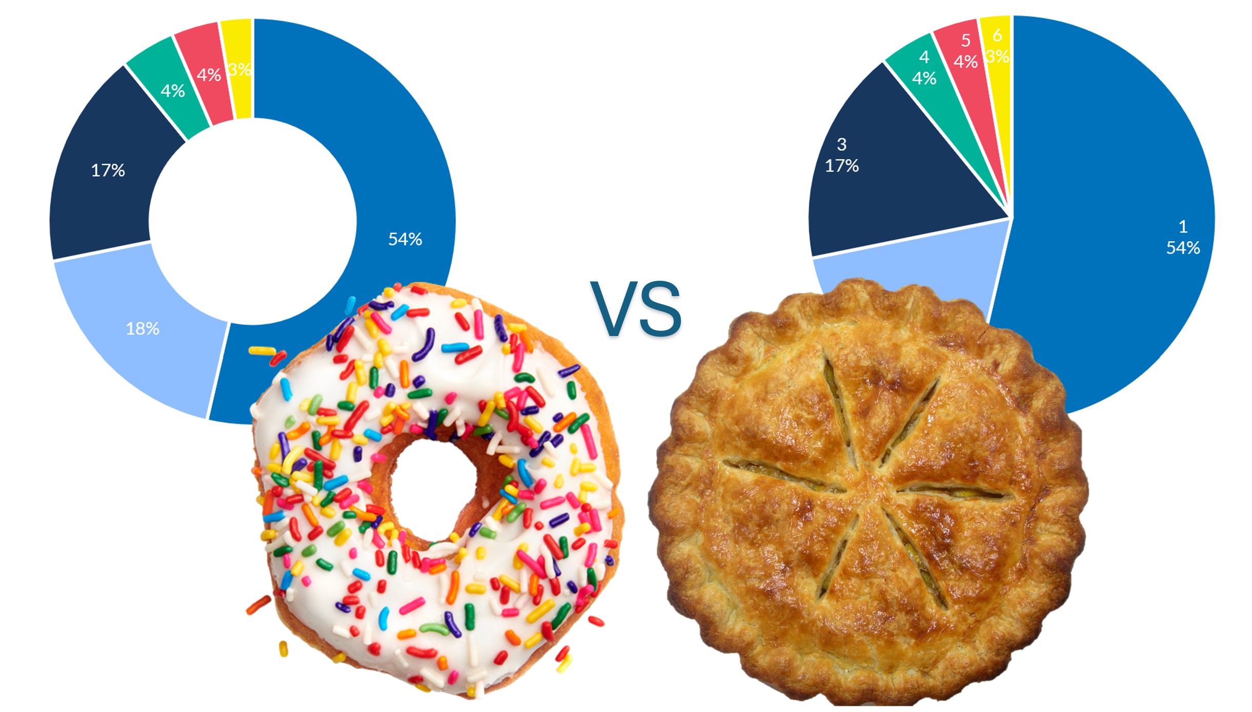
I was preparing visualizations for a quarterly report for a specific unit. Their structure had changed – instead of 4 categories like last year, this year they had 6 categories.
They sent me an Excel file with the updated indicators and numbers. I processed the data, grouped indicators under each of the 6 categories, and started to visualize.
They had used a pie chart previously, so I tried replicating that.
But something felt… off.
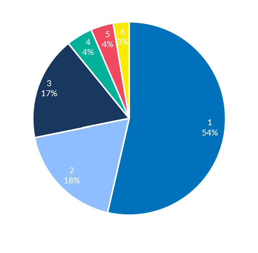
:. One category was over 50% of the total.
.: The remaining five squeezed into the leftover space.
:: Visually, it looked unbalanced and heavy on one side.
So I made a small change: I converted it into a donut chart.
Same data. Same color palette. Just one change.
And the result? Visually calmer. Less crowded. More aesthetically pleasing. The reduced visual weight gave each category more breathing room. It didn’t fix the imbalance – it just made the imbalance less overwhelming.
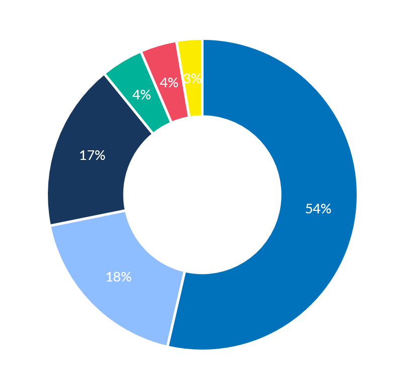
That small visual choice did something I didn’t expect:
:. It made the head of the unit stop and reflect.
.: She rethought the number of categories, and decided to merge two into one – bringing the total to 5. Ultimately, it can change the planning and programming for foreseeable future.
That’s the power of a well-designed visualization. It doesn’t just present data – it invites reflection, supports better decisions, and shapes how we feel about what we see.
My Evolved Take on Donut vs Pie
So here’s where I land now – building on FT’s vocabulary, and adding a bit from experience:
:::.: If you have more than 5 categories, and it’s clearly a part-to-whole story, a donut chart can be very effective, especially if you use the center space wisely.
:.:.: If you have one category which is disproportionately larger compared to other categories, a donut is aesthetically better than a pie. It softens visual dominance and reduces clutter.
So yes, the original advice still holds – don’t default to pie or donut charts.
But once you move from Shu to Ha to Ri – once you’ve learned the rules, internalized them, and start to see when and how to flex – you realize that:
Sometimes, the right donut is not just allowed – It’s actually the better design.