When it comes to creating dashboards, usability is my guiding principle. It’s not just about making data accessible; it’s about designing tools that cater to diverse audiences, each with unique needs and priorities. The UNHCR Ukraine Response Factsheet dashboard is an example of how one tool can serve multiple purposes, ensuring clarity, consistency, and efficiency across the operation.
To explain the concept, I like to compare it to a house. Imagine you’re considering buying a house. Would you judge it solely based on an exterior photo? Likely not. You’d want to explore the interior and check the blueprints to see how everything is structured. Similarly, dashboards need to provide different levels of detail for different users.
The Anatomy of the Dashboard
Here’s how the UNHCR Ukraine Response Factsheet is structured:
The Exterior: Achievement Page
Purpose: A high-level snapshot of our achievements.
Users: Senior management and external relations teams.
This page showcases our progress across major sectors like Protection, Cash, Shelter, NFI, all in a few concise bar charts. It’s designed for quick consumption – perfect for senior managers who need to grasp the big picture at a glance.
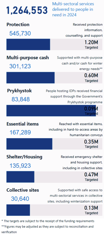
The “Exterior” is like the façade of a house. It’s clean, simple, and gives stakeholders a quick impression of our overall performance.
This page is used in all of the monthly UNHCR Ukraine Delivery Updates: https://data.unhcr.org/en/country/ukr
The Interior: Response Factsheet 1-Pager
Purpose: A detailed but easy-to-understand view of what’s happening on the ground.
Users: Heads of offices, partners, and those interacting with donors or local authorities.
This page offers more depth while still being visually appealing and straightforward. It allows users to communicate our achievements effectively, bridging the gap between high-level insights and operational details.
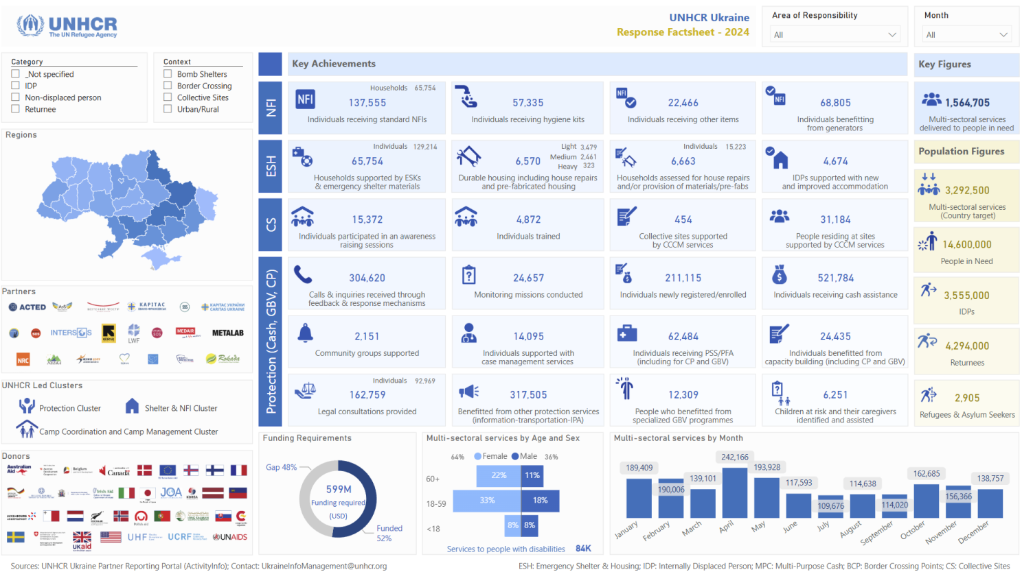
If the “Exterior” is about making an impression, the “Interior” is about creating a connection. It’s the living room of the dashboard – inviting, functional, and informative.
The Detailed Schema: Indicators Page
Purpose: A comprehensive breakdown of data for operational decision-making.
Users: Managers, coordinators, and technical teams.
This page dives into the nitty-gritty: indicators broken down by time, location, and population groups. It’s the blueprint of the dashboard, providing the fine details needed to support critical decisions.
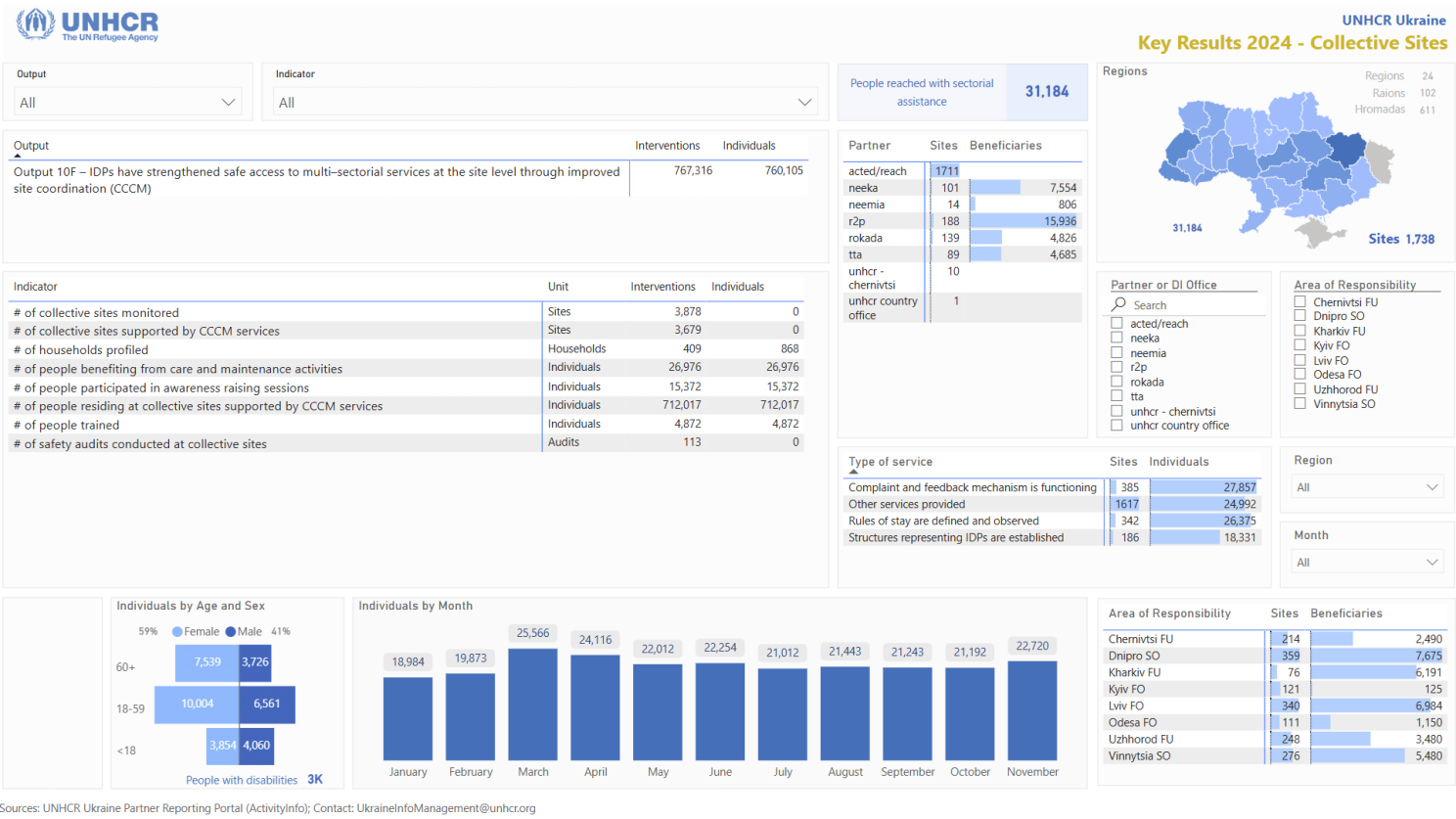
For managers and coordinators, this is where they find the wires and pipes of the operation – everything they need to ensure the system runs smoothly.
The Map and Trends: Geographic Coverage and Time Analysis
Purpose: To visualize where and how progress is unfolding across regions over time.
Users: Operational managers, field teams, and decision-makers focused on regional trends.
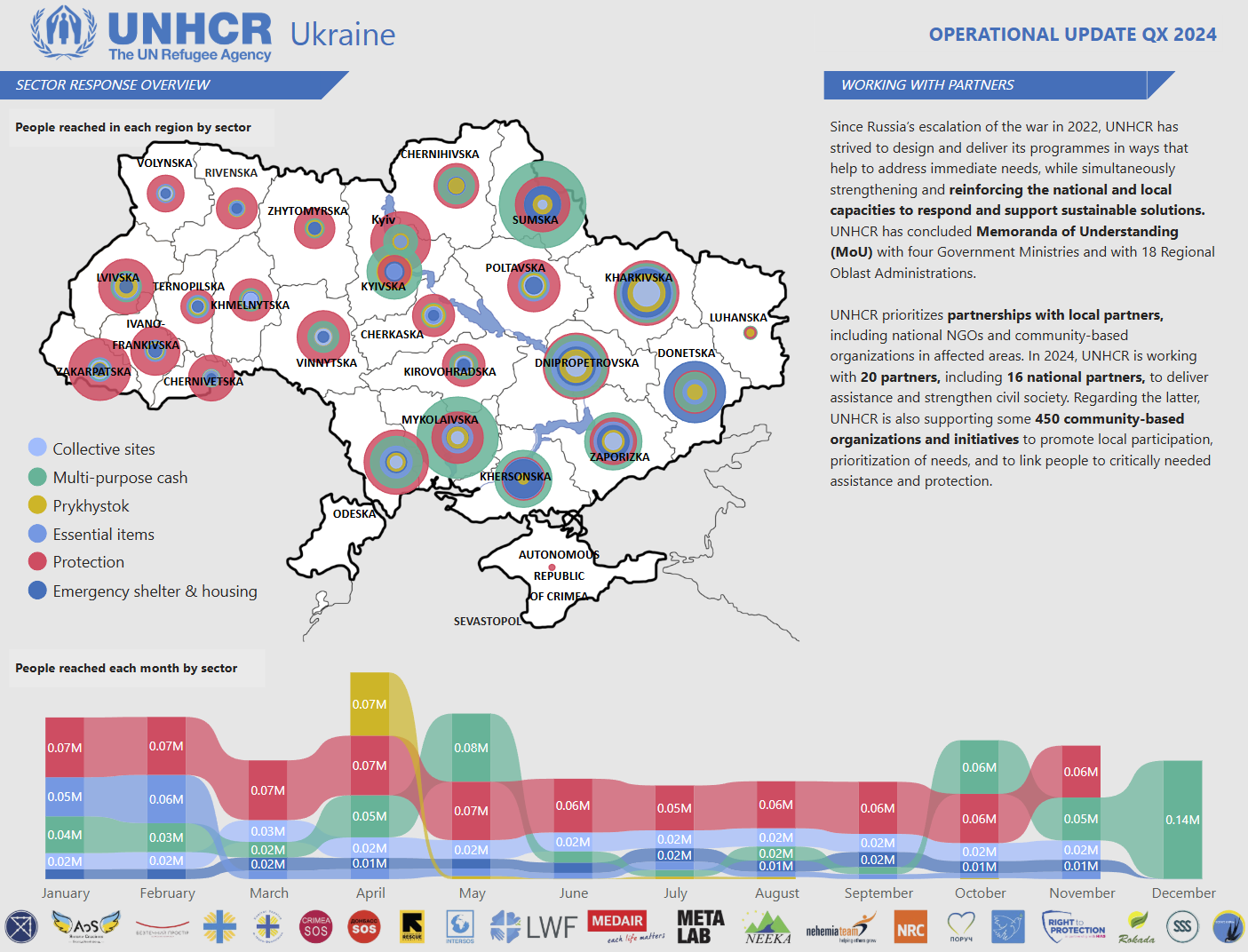
The Map and Trends page is where spatial and temporal data come to life. This page integrates geographic information with timelines to show which regions are receiving support and how activities are progressing over the months.

On the map, viewers can immediately see the geographic spread of UNHCR activities across Ukraine. The visualization makes it clear where efforts are concentrated.
The trends component complements the map by providing a timeline of achievements, making it easy to identify when key milestones were reached. This combination of spatial and temporal data gives stakeholders the context they need to assess the effectiveness and timeliness of the response.
Why This Matters
The beauty of this dashboard lies in its versatility. By designing it with multiple stakeholders in mind, we’ve created a tool that works across all levels of the operation:
- Senior management relies on the “Exterior” to track overall performance.
- Heads of offices use the “Interior” to communicate with partners and donors.
- Managers and coordinators depend on the “Schema” to make informed decisions.
And the best part? It’s efficient. By creating this dashboard at the start of the year, we ensure consistent, reliable insights throughout the operation, saving time and resources.
Lessons Learned
- Understand Your Stakeholders: Every user has different needs. Tailor your dashboard to address them effectively.
- Balance Design and Functionality: A dashboard should be both visually appealing and highly functional.
- Think Long-Term: Create tools that can be used repeatedly, not just for one-off reporting.
Excited to hear your thoughts! If you’d like to jump into the discussion or share your insights, just follow this link, and let’s keep the conversation going:
https://www.linkedin.com/pulse/creating-dashboards-purpose-serving-diverse-single-tool-alen-chalak-2jwjf/?trackingId=NVseOvBYTNmlQqFBBLRfjg%3D%3D

